Diamonds in her eyes

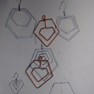
An initial idea sketched onto the back of a receipt at work which moved from sketchbook, to pen and ink illustration, to physical object.

Diamonds in diamonds in your ears.

Spurred on from the experimentation for a new shaped zine, shapes interlocked and the overall idea for a set of earrings came about, I already loved the compliment of brazed copper for jewellery so designed with the use of those materials in mind and keeping vigilant of their flaws and limitations, which meant a very simplified design to the initial versions as to minimise damage through reheating for multiple brazes.

FJIMG_20171103_132132FJIMG_20171103_143912

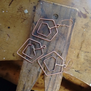
To polish, after shaping a brazing, a normal polishing wheel wouldn’t reach around the intricate curves so a rotary tool with soft wire brush was used to clean away debris from within the shapes and then a heavy polishing abrasive to give the desired satin finish.

Let’s get zany with a Zine

The second graphic communication rotation brief was short and simple, produce a zine of at least 10 pages, any content, any shape, any style.
A brief as open and accepting as the message behind zine’s in the first place, a simple and rough way of getting your message across to like minded people, through art and literature.

Zine’s are almost exclusively rectangular and read like a book, so I decided to mix this up and experimented with different usable shapes. I found hexagons to unfold perfectly into a circular pattern when joined at the correct edges so ran with this and took inspiration from the PeopleOfPrint Posterzines to use the back panel as a large format poster, with all the literature on the front.

Following the season I went with a collection of autumnal poems by famous authors for the content and matched them with simplistic symbolic prints, sadly with the limitation of time these prints had to be drawn instead.
The title ‘TYPO!’ as a simple irony to the beautiful poetry held within.

Curves, Corners and Edges – An Obsession Session.

This weeks formal drawing day was a study of the 3D forms:

Curves, Corners and Edges.

We were challenged to observe the world around us and pick out the very details that make it up, everything has at least two of these attributes, if something has edges but no corners, it must have a curve to finish the shape and vise-versa. With our observations we make models, drawings, texture studies and photographs of these things.

I focused on the many lines along the tops of buildings throughout the city of Hereford, along their facades, cutting away at the pure blue sky.

Screen Prints from stencils

A couple week ago we were tasked with producing screen printed designs on paper to use later in our textiles rotation.;
We started by drawing still life objects in a variety of styles, negative space, continuous line, collage, ect. With these drawings we developed simple designs to be cut into acetate stencils used for our screen printing.

There are two main ways to screen print:

UV etching the design into the screen using a photosensitive emulsion and templates or a printed transparency, this method allows for extremely intricate designs that are extremely reusable and wont deteriorate as quickly as a separate stencil.

Stencil printing, where a design is cut into a stencil and then taped onto the blank screen so only the cut away portions of the stencil are printed through. This method is quicker and requires less technical preparation or cleanup than a UV etch, however it isn’t as accurate and will deteriorate with time and use alot worse than the UV.

We only used a selection of 3 dyes, a dark blue, yellow and magenta, but this allowed some layering between the yellow and magenta to produce the stereotypical screen blend.